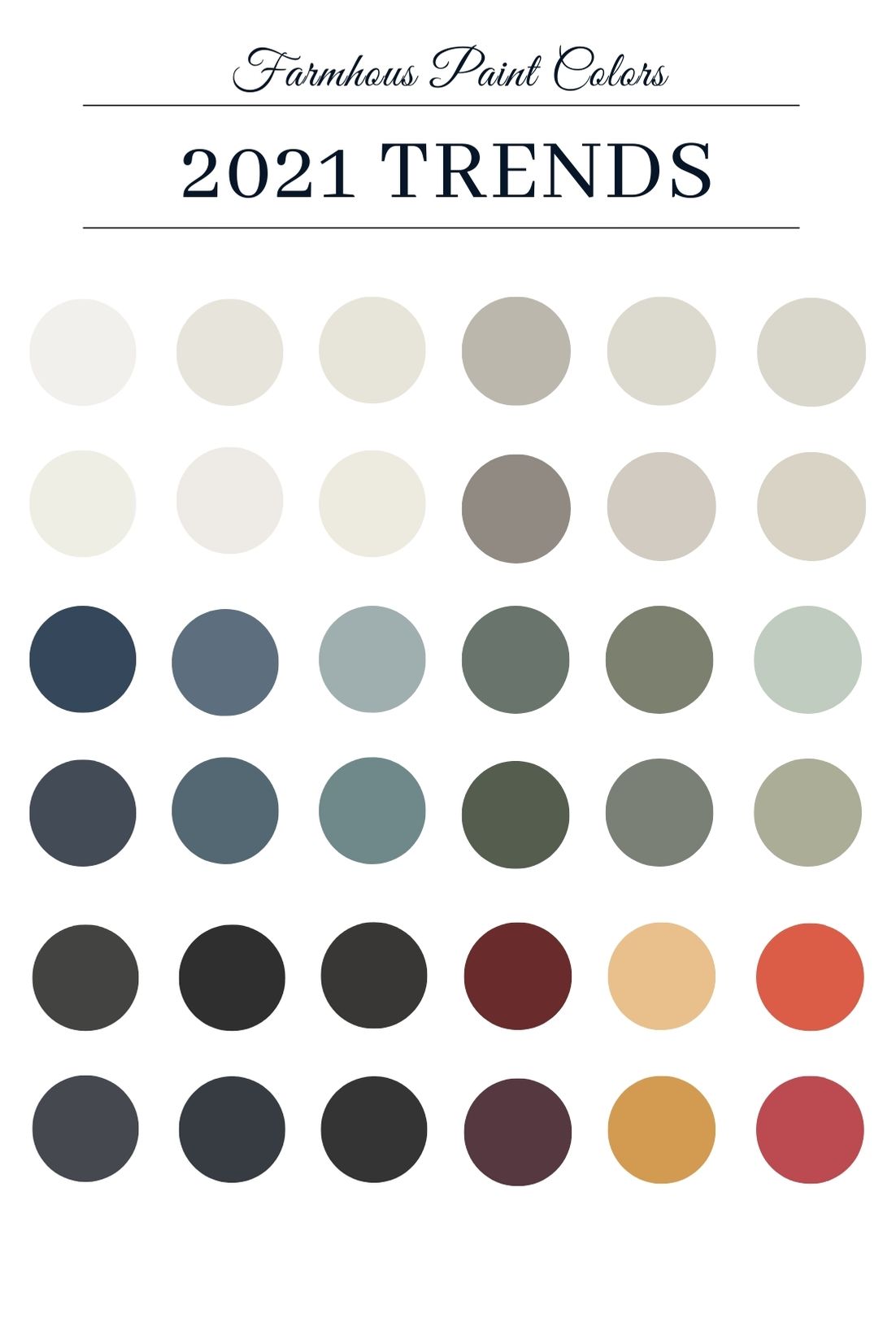
All the paint companies have revealed their colors of the year by now and while some of them are not my thing, other trends I completely adore. Some of my favorite paint colors for the year will include some of their picks and a few that are old favorites. These colors are beautiful as farmhouse paint colors or modern farmhouse paint colors, but also will work perfectly in any home – whether a suburban bungalow or a city loft – to make it feel warm, inviting and beautiful.
When it comes to finding the perfect farmhouse paint color, I’m always looking for colors that feel just a little muddy and soft. Whites with touches of brown, blues with touches of black, greens with a bit of gray…Basically, colors that are soft and look lived in while reflecting elements of nature.
 Beautiful Blues
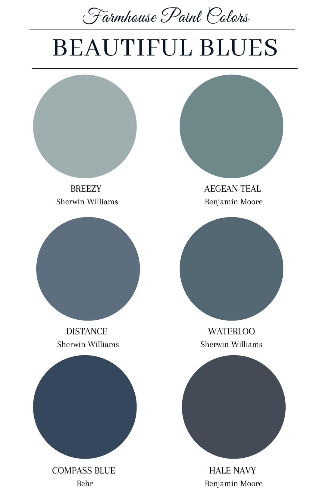
I have a thing with blue. It’s one of those colors that I could probably decorate with throughout the decades. It always calms me and makes me breathe a little easier. And after the last year, we could all use that. Here are my favorite Moody Blue farmhouse paint colors that can breathe a little life into any room.
Hale Navy by Benjamin Moore – A stunning navy color that is dusty and thoughtful.
Aegean Teal by Benjamin Moore – A gorgeous teal that’s Benjamin Moore’s color of the year. It’s almost an antiqued blue that would look perfect in any room.
Compass Blue by Behr – A deep, navy blue with a hint of red that looks similar to Navy by Sherwin Williams, which we used once upon a time in my son’s baby room.
Breezy by Sherwin Williams – A pretty gray blue that I could use in my bedroom. Soft, calming but still giving off that farmhouse paint colors feeling.
Waterloo by Sherwin Williams – A deep blue with a touch of green that makes me miss the ocean with all my heart.
Distance by Sherwin Williams – A lovely blue that reminds me of my living room couches. Very full of warmth while being a true blue.
 Nature Inspired Greens
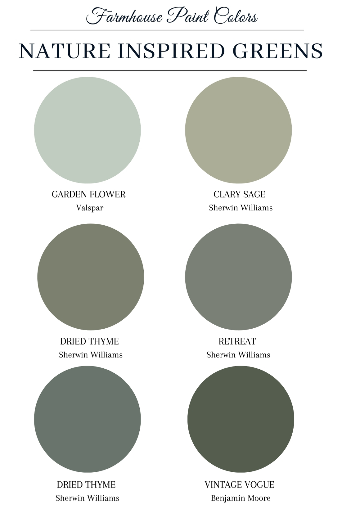
Green is another color I love. In my early 20’s I painted my bathroom lime green. In my mid 20’s I painted my dining room a pretty shade of olive. Now, as a full fledge grown up, I can see these green, nature-inspired farmhouse paint colors being a part of our home. While I don’t know that they will cover a wall here (although my son wants a dinosaur room so don’t count me out), I can see a lot of these colors on pieces of accent furniture to warm up our space.
Retreat by Sherwin Williams – I could see this rich color in my office. It’s cozy, warm and inspiring.
Garden Flower by Valspar – This is a pretty, light green that has a touch of brown and gray. It would look beautiful in an entryway or a piece of furniture in a child’s room.
Clary Sage by Sherwin Williams – This is a bit of a gray green that reminds me of a dusty stem color in the garden. I could see it in a bathroom.
Heritage Park by Behr – A dusty, moody blue-green that’s cozy and Earthy.
Dried Thyme by Sherwin Williams – I need this somewhere in my house this year. It’s the aged, antiqued green of my dreams.
Vintage Vogue – A dark green that reminds me of the undersides of leaves when the sun is shining through from above.
Warm Whites
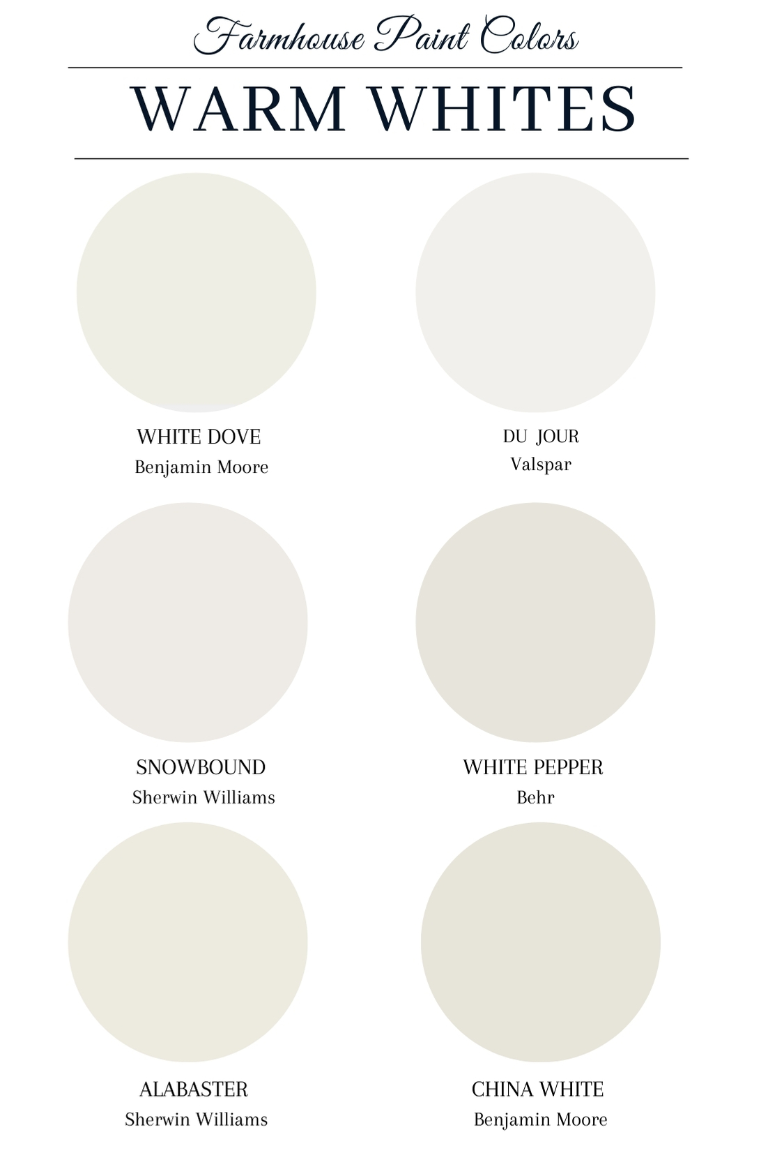
Whites won’t be going anywhere anytime soon. Perhaps the quintessential farmhouse paint color, creamy and warm whites will still be a staple. However, the color has shifted over the last few years. Instead of stark white on stark white, these whites are warmer, cozier and more lived-in that the colors that started the white trend.
Du Jour by Valspar – A light white but with a beautiful, warm tone.
Snowbound by Sherwin Williams – A dusty, creamy white that we have on all of our trim. I wish it were on all my walls instead of my trim.
Alabaster by Sherwin Williams – A light and creamy white that it perfect for those looking for a warm white. We have it on a buffet I designed and built.
China White by Benjamin Moore – VERY CREAMY! This almost boarders on beige but has a bit more yellow.
White Dove by Benjamin Moore – A popular color for years, this is a creamy, dreamy white.
White Pepper by Behr – My all-time favorite color that does not get enough credit. We have it in our bedroom and used it in our old house too. It’s a very, very warm light gray/white. Think of it as white with a few drips of black added in.
Bold Blacks
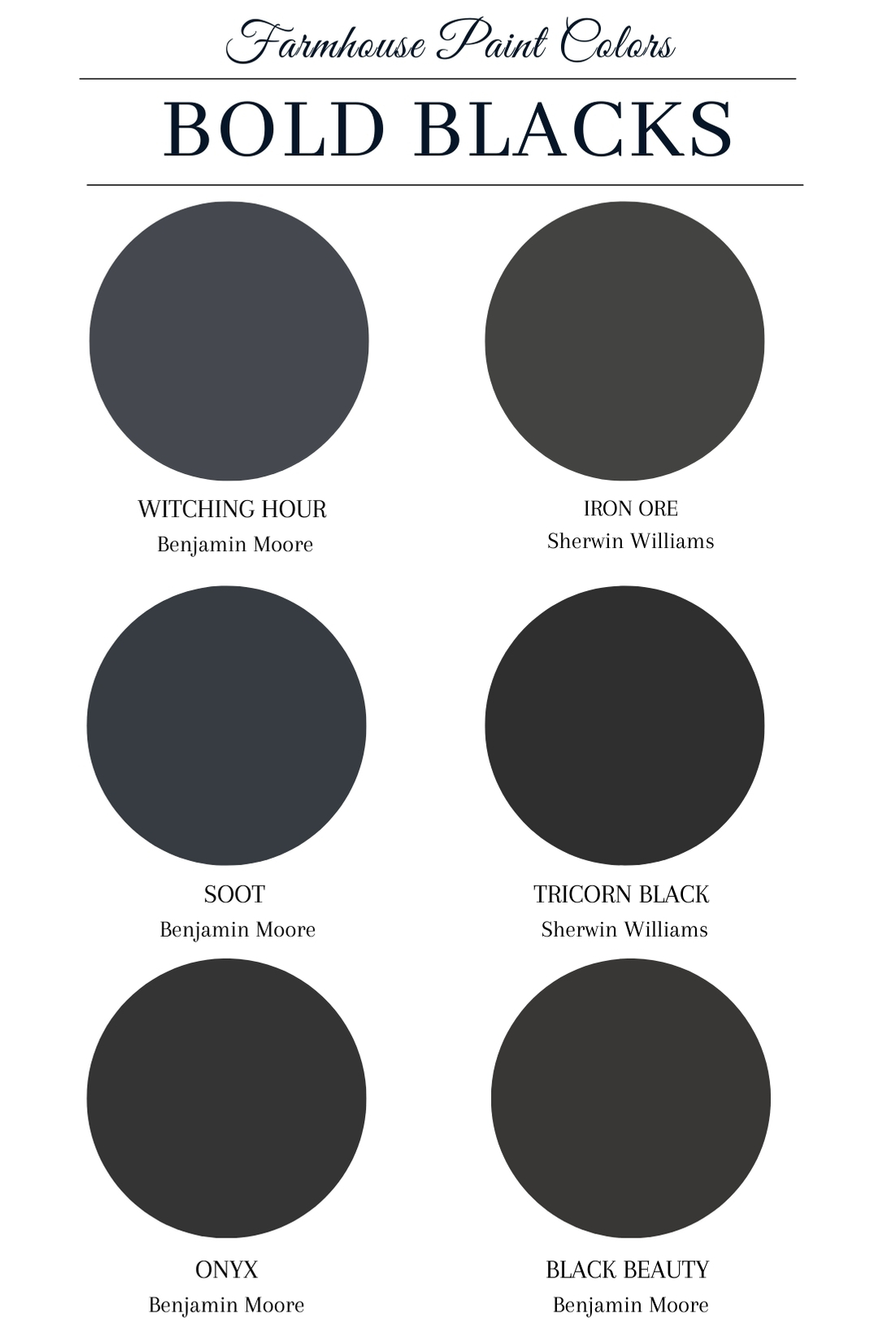
And on the opposite end of the spectrum, we have black paint colors making a splash onto the scene. These are certainly more modern farmhouse but they really warm up a space when used as an accent in a room. Whether it’s a wall, a kitchen island, a front door or another element, black will be a trend that hangs on for a bit to help make your space comforting and modern.
Soot by Benjamin Moore – A color that actually reminds me of the soot left by the barbecue after an evening of food and fun.
Black Beauty by Benjamin Moore – A dusty black – like the coat of a black horse who needs to be brushed.
Onyx by Benjamin Moore – This black has a bit of a red tone when compared to other’s but it will fall into the category of a true black.
Iron Ore by Sherwin Williams – A soft black for those that can’t commit to the deeper ones. Almost a very dark gray.
Tricorn Black by Sherwin Williams – A true black with just enough blue and red to even it out. We used this on the front door of the barn.
Witching Hour by Benjamin Moore – A black with a little bit of cool blue. Like the sky at midnight.
More beige than greige
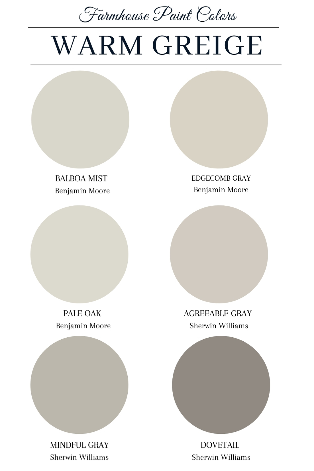
I believe true, pure greys with their blue undertones are on their way out. And while greige has been a thing for a while, this year I think the beige in the equation will come through stronger. And I say that as I stare at all my walls that are painted Repose Grey 50 percent lightened. Here’s a few that add that lovely brown hue back in.
Pale Oak by Benjamin Moore – A gorgeous, soft and warm light greige.
Balboa Mist by Benjamin Moore – A true beigey greige, I can see this on my walls as I switch out from the cooler gray tones to warmer colors and warm whites.
Mindful Gray by Sherwin Williams – This is directly below my home’s Response Gray on the color wheel, but it’s deeper with a touch more brown. Maybe I do this 50 percent lightened next?
Agreeable Gray by Sherwin Williams – One of the most popular colors for years, I think this one will hold strong as people start turning to warm hues. It has a lot more brown in it than the blues found in gray.
Edgecombe Gray by Benjamin Williams – A creamy beige that’s not yellow at all and makes me wonder why the word “gray” is in the name.
Dovetail by Sherwin Williams – A beautiful, deep beige with just a touch of the gray
Color Pops
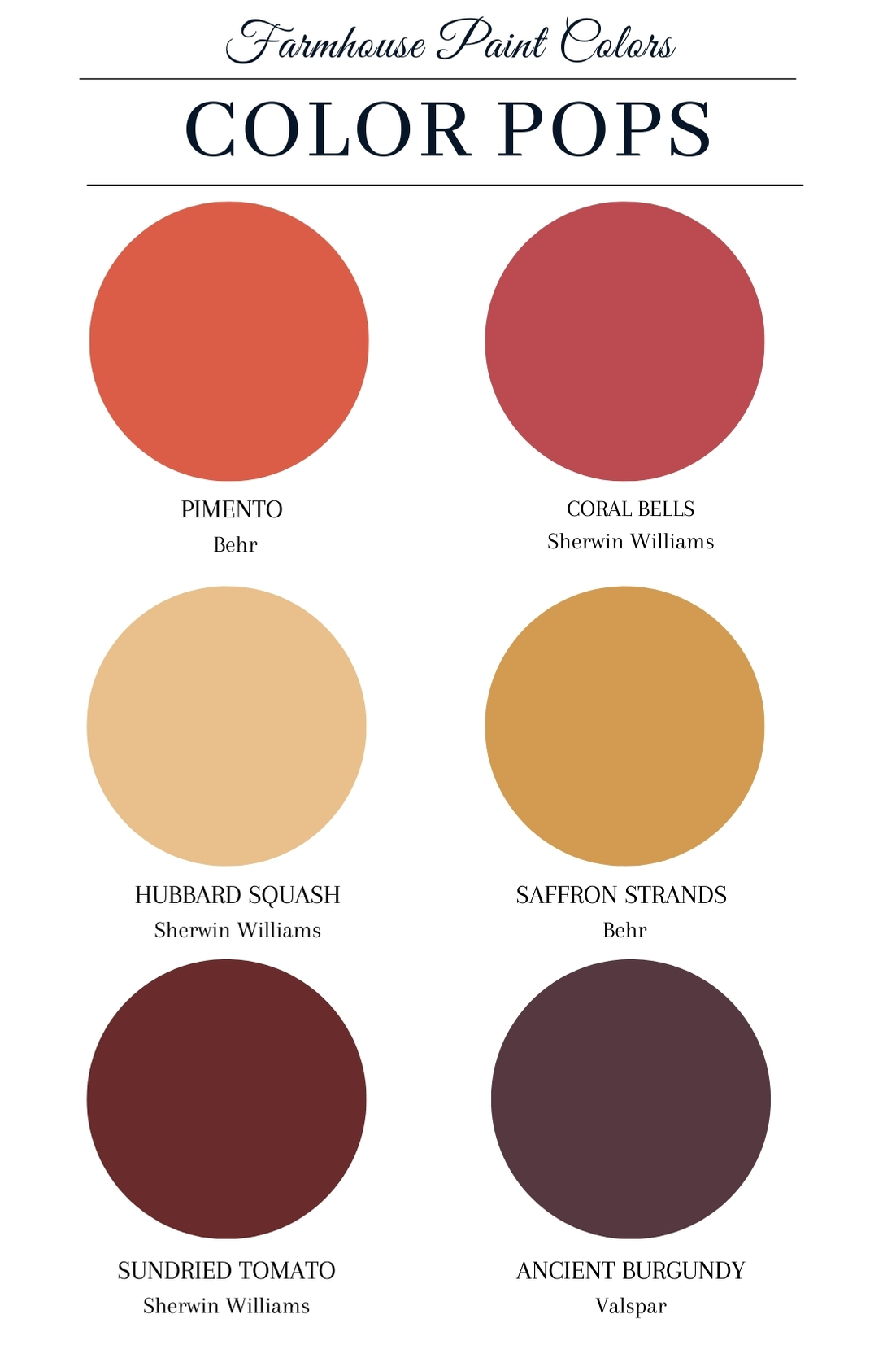
Many big-name designers are predicting color pops as a trend for the year. While I don’t think I’ll be jumping on the gray with bright yellow bus anytime soon (As I mentioned above, I’m a bit over gray), I do love some of the Earthier pops that are starting to be found in decor.
Ancient Burgundy by Valspar – A beautiful jewel tone that I can see in the bedroom or even a dinning room.
Sun dried Tomato HGTV HOME by Sherwin Williams – A deep version of the color of an heirloom tomato when it’s perfectly ripened.
Coral Bells by Sherwin Williams – A reddish/pink that’s feels young enough to be fun but old enough to know better.
Pimento by Behr – A happy color that’s a mix of red and orange with a touch of brown.
Saffron Strands by Behr – A deep golden yellow that makes me think of sunflowers in the fall. Warm and beautiful.
Hubbard Squash by Sherwin Williams – This reminds me of a soft, yellow daffodil or butter. Both of those things make me feel happy.
So friends, what do you think? Could you see any of these farmhouse paint color trends in your home this year? Let me know in the comments below!
Thank you so much for visiting today! I hope that you will come back again to see what else we’re up to here at Sugar Maple Farmhouse.
 Beautiful Blues
 Nature Inspired Greens




These are all really nice colors. I really enjoy those muted greens. They’re very soothing.
These are all such amazing colors. I do want to repaint my home at some points. I’ll probably go for blues!
I love these subdued yet vibrant colors. They will definitely add character and beauty to any room.
Those are beautiful colors! I would love to repaint my house one of these gray tones and the front door with the red!
I’m definitely obsessed with all these colors. Makes me want to change one of my rooms… again.
I’m all for the blues and more natural colors. It’s perfect for the home.
These are some really nice colors.
These are some soothing and truly fancy colors for a farmhouse of dreams. Your taste is immaculate.
I don’t think that my style is the traditional farmhouse style but those are my colors! Love the earthy, rich hues!
These are all gorgeous colors! I have a hard time picking out paint colors so thank you for the inspiration.
We just used Retreat by Sherwin Williams in our bedroom and I love it! This list is amazing, thank you.
I am loving all the blue and the soft colours. They are so my style!
These 2021 farmhouse paint color trends are so soft and beautiful! I love Aegean teal!
Thanks for this color suggestions,I love blues and greens.
Oh great,great color suggestions. I love the greenish gray,it looks perfect and of course the blues,any blue here would be great.
we are looking to repaint our powder room I am loving some of these colors. Thanks for the inspiration
These color combination are absolutely marvelous, its a great earth color that can bring joy and up lift one’s spirit.
I’m particularly fond of the colors agreeable gray and coral bells.I may use them in my front entry way this spring.
I am kind of wanting to do a darker color in my bedroom against the white furniture. Hale Navy might look really nice. Need to go grab a sample!
Nice colours, I love grey and white
I have always loved these earthy kinds of colors. I have some of these in my house already!
It was interesting to look at this slate of colors. It is interesting to see what colors remain popular and in style year after year.
Wow! These colors all sound so wonderful to use to our farmhouse this 2021! I want to try the deep blue with a touch of green.
1
All of these colors are amazing! I am loving all the blue hues and a few of the blacks and greys as well
What gorgeous earthy swatches! I love the warm greige colours. Definitely plenty of inspiration here!
My first choice would always be those popping colors.. but love all these swatches
I love all these colors. They are my style, especially the first 4 rows! They are such relaxing colors!
All these colors are beautiful. I love neutral colors and the warm greige colors are my favorites.
Those are such amazing colors, will definitely add beauty to any room😍 I love soft, muted colors for my home❤️
One of my dream is to have my own farm house. I would love to have it painted with color Hale Navy or Aegean Teal. Putting in under my goal list to look forward and make it a reality.
In the process of painting, so loving the blues & greens! Btw, you have Dried Thyme for 2 colors in the greens. Beautiful colors!
Your color palette that featured inspiring greens was definitely the one I liked the most. I’ve always wanted to try more natural colors with my house and finding a great shade of green was a bit difficult. However, now that I have your guide, I know what to use when I hire a residential painting expert from the area.
https://www.perfpaint.com/services
Where do you by this paint in australia
In your opinion, does agreeable gray go well with dried thyme? I need a greige for my walls after we paint the cabinets green.
Which color do you recommend for a kitchen with white subway tile?
I love sundried tomato for the front door. What Sherwin Williams gray would look good with it?
In this article, I will be talking about the most sought after paint colors in the country for this specific year. These paint colors are sought after because they are a great color to go with most all of the color schemes that you may have in your home. Since these paint colors are sought after, most people will have a different opinion on what their favorite paint color is. Which is why I am going to list the most sought after colors and you can decide for yourself which one is your favorite. The colors I am going to list are: Fox-Trot Beige, Seaside, Paloma, Pebble Sand, Oasis, Alabaster White, and Snowbound.
https://washingears.com/sebo-vacuum-reviews/
The farmhouse color trend features colors that are very neutral. The colors are usually colors that are considered warm. These color schemes provide a very earthy vibe with neutral shades. The colors are often described as very soothing, which is perfect for the style.
https://zanove.com/who-invented-lasagna/
I had my whole townhouse painted PALE OAK with Benjamin Moore WHITE for the trim. It’s a gorgeous neutral that is calming and light and airy in a sun filled room. I love all the other colors you picked out. The blues, greens, blacks, and even the pops of color are gorgeous accents (pillows, artwork) etc.if you want a basic neutral space with some pizzazz
Sounds beautiful